A new logo and a film
De Smederij · Education · 2025
A new brand for a training centre in Soerendonk: logo, colour and typography, followed by a film about the place, shot on location.
- The question
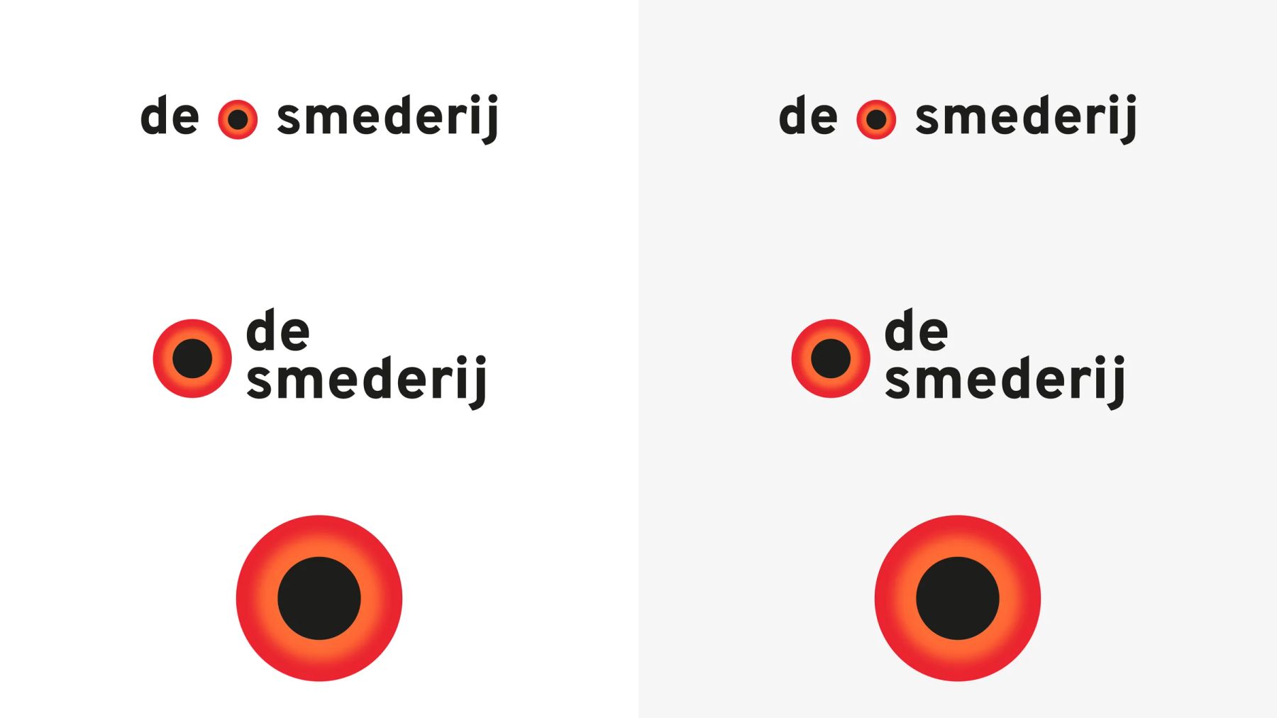
- De Smederij trains people in energetic systemic therapy and family constellations. The logo had grown over the years: lots of colours, a shape without a story. The brief: a brand that carries the calm and the honesty of the place.
- The approach
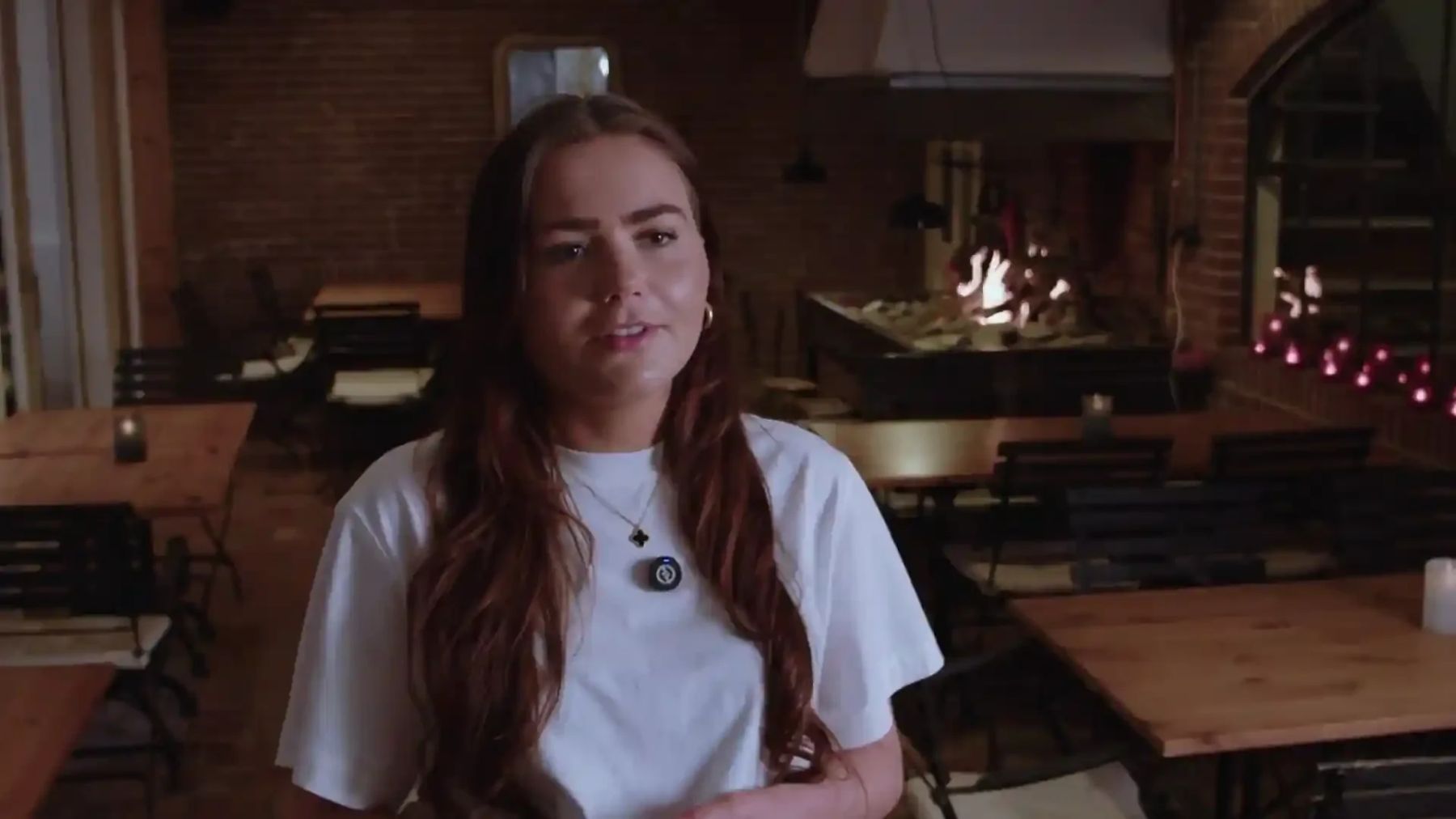
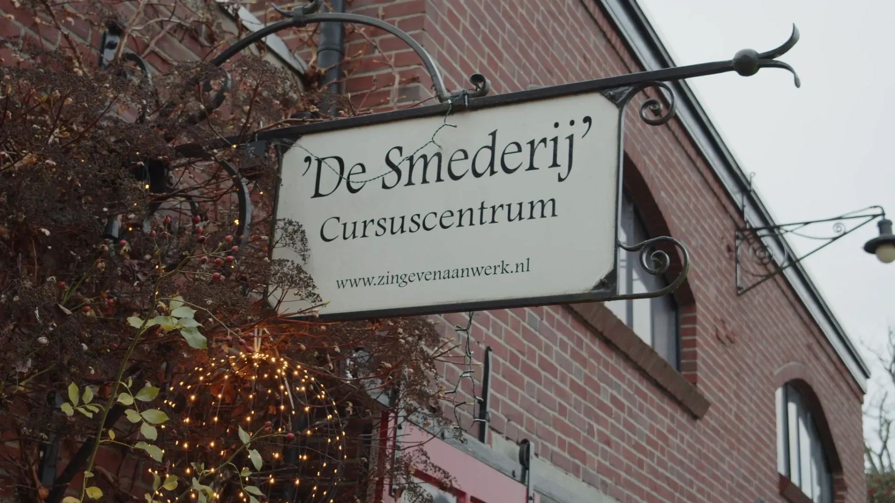
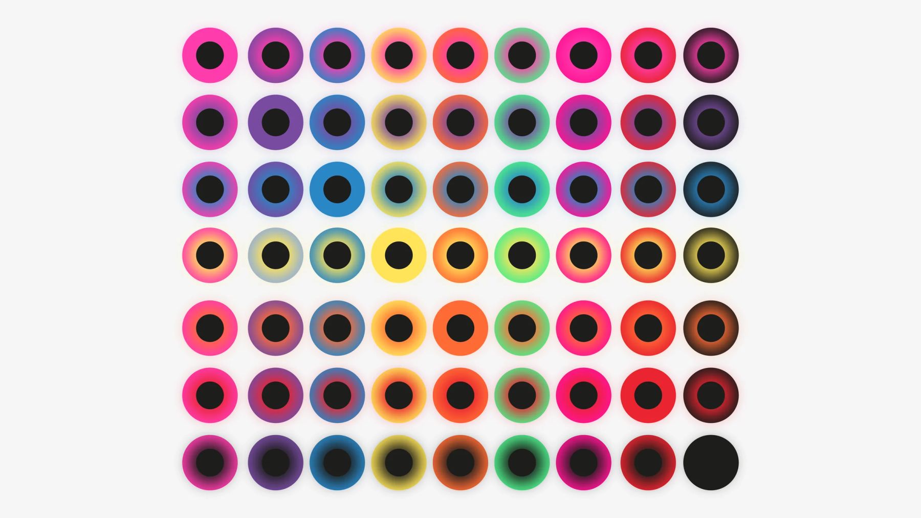
- We analysed the existing logos and chose a circle with a core and a glow, one typeface and a palette that can shift colour per course. Then a film: a conversation on location with atmospheric footage of the building and the nature around it, without voice-over.
- The result
- The new logo is on De Smederij’s site, and so is the film. Both speak the same language.